nuxt-toc


Nuxt Content プロジェクトで目次 (TOC) コンポーネントを使用するためのNuxtモジュールです。
機能 ✨
- 🎨 高度なカスタマイズ性:独自のニーズに合わせて調整できます。
- 🔍 アクティブなTOCハイライト:現在表示中のセクションが簡単に分かります。
- 📦 すぐに使える:最小限の設定で利用できます。
- 🔗 セクションリンク:コンテンツ内をシームレスに移動できます。
- ♿ ARIAサポート:すべてのユーザーのアクセシビリティを確保します。
- 🆓 無料かつオープンソース (MITライセンス):自由に使用、変更、配布できます。
クイックスタート 🔧
- Nuxtアプリケーションにモジュールをインストールします。
npx nuxi module add nuxt-toc
- 目次が必要な場所に
<TableOfContents />を追加します。
<template>
    <ContentDoc />
    <TableOfContents />
</template>
重複したフェッチを防ぐために、自分でTOCを渡すこともできます。
<template>
    <ContentRenderer :value="data" />
    <TableOfContents :toc="data.body.toc" />
</template>

<script setup>
const route = useRoute()

const { data } = await useAsyncData('home', () => queryContent(route.path).findOne())
</script>
プロパティ
| プロパティ | 型 | デフォルト | 説明 |
|---|---|---|---|
toc | JSON | null | 提供された toc データを使用します。toc が渡された場合、このコンポーネントはTOC情報を自身でフェッチせず、path プロパティは無視されます。 |
path | 文字列 | '' | TOCが生成されるコンテンツへのパスです。設定されていない場合は、現在のURIが使用されます。 |
isSublistShown | ブール値 | true | TOC内のサブリストを表示するかどうかを決定します。 |
isTitleShownWithNoContent | ブール値 | false | TOCにコンテンツがない場合でもタイトルを表示するかどうかを決定します。 |
title | 文字列 | 'Table of Contents' | TOCのタイトルです。 |
スタイル
| ID/クラス | 型 | 説明 |
|---|---|---|
toc-container | ID | 目次 (TOC) のコンテナです。 |
toc-title | ID | 目次(TOC)のタイトルです。 |
toc-item | クラス | TOCアイテムの一般的なクラスです。 |
toc-topitem | クラス | 最上位レベルのTOCアイテムの特定のクラスです。 |
active-toc-item | クラス | アクティブなTOCアイテムに適用されます。 |
active-toc-topitem | クラス | アクティブな最上位レベルのTOCアイテムに適用されます。 |
toc-link | クラス | TOCリンクの一般的なクラスです。 |
toc-toplink | クラス | 最上位レベルのTOCリンクの特定のクラスです。 |
toc-sublist | クラス | TOC内のサブリストをスタイル設定します。 |
toc-subitem | クラス | サブレベルのTOCアイテムの特定のクラスです。 |
active-toc-subitem | クラス | アクティブなサブレベルのTOCアイテムに適用されます。 |
toc-sublink | クラス | サブレベルのTOCリンクの特定のクラスです。 |
toc-item-${link.id} | ID | link.idに基づいて、各TOCアイテムに動的に生成されるIDです。 |
toc-topitem-and-sublist | クラス | 最上位レベルのTOCアイテムとそのサブリストをスタイル設定します。 |
!注記
<TableOfContents />コンポーネントのデフォルトのスタイルは.active-toc-item { color: #fef08a; } .toc-sublist-item { padding-left: 1rem; } a { text-decoration: none; color: inherit; } ul, ol { list-style: none; padding: 0; margin: 0; }スタイルをカスタマイズしたり、リセットしたりするには
.active-toc-item {
  color: initial;
}

.toc-sublist-item {
  padding-left: initial;
}

a {
  text-decoration: underline;
  color: initial;
}

ul,
ol {
  list-style: initial;
  padding: initial;
  margin: initial;
}
クックブック
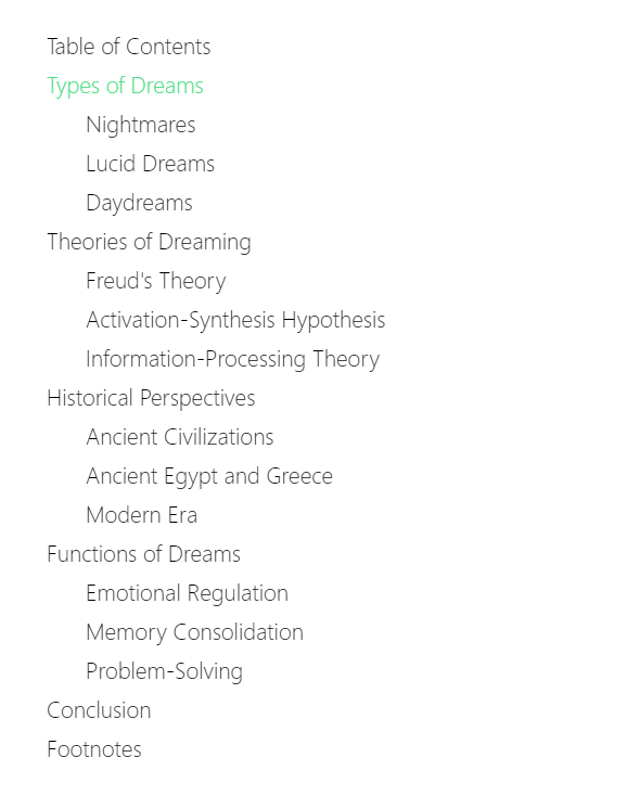
例1
アクティブなアイテムのカスタムカラーとサブアイテムのカスタムパディング
<template>
    <ContentDoc />
    <TableOfContents />
</template>

<style>
/* Styling for active Table of Contents items */
.active-toc-item {
  color: #4ade80;
}

/* Indentation for second-level Table of Contents items */
.toc-sublist-item {
  padding-left: 1.5rem;
}
</style>

<!-- Or with Tailwind CSS
<style>
.active-toc-item {
  @apply text-green-300
}

.toc-sublist-item {
  @apply pl-1.5
}
</style>
-->
結果
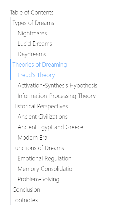
例2
各アイテムの左側にバーを表示する
<template>
    <ContentDoc />
    <TableOfContents />
</template>

<style>
.toc-item {
  border-left-width: 2px;
  border-left-style: solid;
  border-color: #e5e7eb;
  padding-left: 0.25rem /* 4px */;
}

.active-toc-item {
  color: #60a5fa;
  border-color: #60a5fa;
}

.toc-sublist-item {
  padding-left: 1rem;
}
</style>

<!-- Or with Tailwind CSS
<style>
.toc-item {
  @apply border-l-2 pl-1
}

.active-toc-item {
  @apply text-blue-400 border-blue-400
}

.toc-sublist-item {
  @apply pl-4
}
</style>
-->
結果
例3
2レベル目のタイトルがアクティブな場合、1レベル目のタイトルもアクティブにする
<template>
    <ContentDoc />
    <TableOfContents />
</template>

<style>
/* Sublist item is contained in sub list, which is top item's sibling */
.active-toc-item, .toc-topitem:has(+ .toc-sublist .active-toc-sublist-item) {
  color: #60a5fa
}

.active-toc-sublist-item {
  color: #4ade80
}

.toc-sublist-item {
  padding-left: 1rem /* 16px */;
}
</style>

<!-- Or with Tailwind CSS
<style>
.active-toc-item, .toc-topitem:has(+ .toc-sublist .active-toc-sublist-item) {
  @apply text-blue-400
}

.active-toc-sublist-item {
  @apply text-green-400
}

.toc-sublist-item {
  @apply pl-4
}
</style>
-->
結果
ライセンス
このプロジェクトはMITライセンスです。