


@morev/vue-transitions
Vue 2 および Vue 3 用のCSS不要の再利用可能なインターフェース遷移 ❤️
✔️ propsを介して高度にカスタマイズ可能;
✔️ group モードでグリッド/フレックスレイアウトと正しく連携;
✔️ transform や opacity のようなアニメーション要素の初期スタイルを考慮;
✔️ ユニバーサルな Nuxt 2 および Nuxt 3 モジュールでさらに使いやすい。
目次
インストール
❗ 要件
- Nodeバージョン:
>= 18.0.0 - Nuxtバージョン (使用する場合):
>= 2.17.0 || >= 3.5.0
指定されたNodeまたはNuxtのバージョンより低いバージョンを使用している場合、プラグインは動作しません。
yarn の使用
yarn add @morev/vue-transitions
npm の使用
npm install @morev/vue-transitions
pnpm の使用
pnpm add @morev/vue-transitions
bun の使用
bun add @morev/vue-transitions
❗ Bun ユーザーへの重要な注意
このパッケージは、Vueのバージョンを決定し、適切なコンポーネントを提供するために postinstall フックに依存しています。
デフォルトでは、Bunはライフサイクルスクリプトを実行しません。そのため、動作させるには、インストール後にパッケージを trustedDependencies に手動で追加し、再度 bun install を実行する必要があります。
{
  "trustedDependencies": ["@morev/vue-transitions"]
}
使用方法
Nuxtでライブラリを使用する場合は、以下の段落をスキップしてください。
"Nuxtでの使用"セクションへ.
パッケージは2つのバージョンのコンポーネントをエクスポートします
Vue2用のバージョンは、名前付きエクスポート/vue2で利用可能ですVue3用のバージョンは、名前付きエクスポート/vue3で利用可能です
ただし、使用されているローカルバージョンのVueにマッピングされたデフォルトのエクスポートもあります。
内部では、postinstall npmフックを利用しています。
パッケージのインストール後、スクリプトはインストールされているVueのバージョンをチェックし、ローカルのVueバージョンに基づいてエクスポートをリダイレクトします。
これはかなり堅牢に感じられますが、心配な場合は、使用しているバージョンに応じて明示的な名前付きインポートを推奨します。
ちなみに、インストール後にデフォルトのエクスポートを変更できます: コマンド
vue-transitions-version-switch <version>を実行するだけです。
yarnを使用した例:yarn vue-transitions-version-switch 2npxを使用した例:npx vue-transitions-version-switch 3
グローバル登録
Vue3 の使用
import { createApp } from 'vue';
import { plugin as vueTransitionsPlugin } from '@morev/vue-transitions';
import '@morev/vue-transitions/styles';

const app = createApp(App);

app.use(vueTransitionsPlugin({
  // Plugin options (optional, described below)
}));
Vue2 の使用
import Vue from 'vue';
import { plugin as vueTransitionsPlugin } from '@morev/vue-transitions';
import '@morev/vue-transitions/styles';

Vue.use(vueTransitionsPlugin, {
  // Plugin options (optional, described below)
});
😥 「この依存関係が見つかりませんでした」というエラーが出ました
Nuxt 2 のように exports フィールドを解決できない環境では、スタイルのインポートをファイルの直接パスに置き換えるだけです。
- import '@morev/vue-transitions/styles';
+ import '@morev/vue-transitions/dist/index.css';
カスタムオプション
カスタムオプションを設定する際に適切な型情報を取得するには、デフォルトのエクスポートではなく、名前付きエクスポート
pluginを使用することをお勧めします。
カスタムオプションを使用すると、デフォルトのプロパティ値を変更できます。
デフォルト値を変更するには、defaultProps キーをプラグイン設定に渡し、目的のpropsのキーと値のペアをリストします。
コンポーネントごとにデフォルトのpropsを変更することもできます。そのためには、componentDefaultProps キーをプラグイン設定に渡すだけです。
重要: これらのpropsは検証されないため、正しい値で定義していることを確認してください。
import { createApp } from 'vue';
import { plugin as vueTransitionsPlugin } from '@morev/vue-transitions';
import '@morev/vue-transitions/styles';

const app = createApp(App);

app.use(vueTransitionsPlugin({
  // Default duration for all transitions now is `200`
  defaultProps: {
    duration: 200,
  },
  // But for `<transition-expand>` default duration is `500`
  componentDefaultProps: {
    TransitionExpand: {
      duration: 500,
    }
  }
}));
コンポーネントの直接インポート
<template>
  <transition-fade>
    <div v-if="isVisible" class="box">
      Fade transition
    </div>
  </transition-fade>
</template>

<script>
  import { TransitionFade } from '@morev/vue-transitions';

  export default {
    components: { TransitionFade },
  };
</script>
Nuxtでの使用
このライブラリは、名前付きエクスポート /nuxt を介して、Nuxt 2と3用のすぐに使えるユニバーサルモジュールをエクスポートします。
Nuxtを使用する場合、手動インストールではなくモジュールを使用することをお勧めします。理由は次のとおりです。
- Nuxtは、グローバル登録ではなく、オンデマンドでコンポーネントを自動インポートできるため、より高性能なオプションです。
- ただ、そうする方が速いからです :)
使用するには、@morev/vue-transitions/nuxt を nuxt.config.ts / nuxt.config.js の modules セクションに追加します。
export default defineNuxtConfig({
  modules: [
    '@morev/vue-transitions/nuxt',
  ],
  vueTransitions: {
    // The same options as in the plugin itself.
    // You will get an autocomplete using Nuxt 3.
  }
});
トランジションコンポーネントをお楽しみください! 🎉
IntelliSense
Nuxtモジュールを使用している場合は、このセクションをスキップできます - モジュールが自動的に処理します。
このセクションは、VSCode の設定とコンポーネントのグローバル登録にのみ適用されます。
Vue 2を使用する場合
Vetur 拡張機能がインストールされているVue 2を使用する場合、すべてのコンポーネントはヒントを提供する必要があり、アクションは不要です。
Vue 3を使用する場合
Volar 拡張機能がインストールされているVue 3を使用する場合、すべてのコンポーネントはヒントを提供する必要があり、アクションは不要です。
トランジションリスト
TransitionFade
要素の opacity を変更する基本的なトランジション。非常にシンプルです。
コードを表示
<template>
  <transition-fade>
    <div v-if="isVisible">...</div>
  </transition-fade>
</template>

<script>
  import { TransitionFade } from '@morev/vue-transitions';

  export default {
    components: { TransitionFade },
  };
</script>
TransitionExpand
実際の要素サイズを操作するトランジション。
昔からの開発者であれば、このトランジションをjQueryの slideUp/slideDown として知っているかもしれません。slideLeft や slideRight のように X 軸でも機能します (ただし、実際に必要となるシナリオを思いつくのは難しいですが)。
固有のprops: axis
TransitionSlide
transform: translate() を介して要素の位置を操作するトランジション。
目的の要素位置を計算するために offset プロパティが必要で、パーセンテージ値でも機能します。
offset プロパティの操作例
<template>
  <!--
    Element will fade in and fade out to top.
    Initial transform is `transform: translate(0, -16px)`
  -->
  <transition-slide :offset="[0, -16]"></transition-slide>

  <!--
    Element will fade in and fade out to bottom left side.
    Initial transform is `transform: translate(-16px, 16px)`
  -->
  <transition-slide :offset="[-16, 16]"></transition-slide>

  <!--
    Element will fade in and fade out to right,
    and the offset will be relative to the element width itself.
    Initial transform is `transform: translate(100%, 0)`
  -->
  <transition-slide :offset="['100%', 0]"></transition-slide>

  <!--
    Element will fade in from top and fade out to bottom,
    and the offset will be relative to the element height itself.

    Transform before element appears: `transform: translate(0, -100%)`
    Transform when element disappears: `transform: translate(0, 100%)`
  -->
  <transition-slide
    :offset="{
      enter: [0, '-100%'],
      leave: [0, '100%']
    }"
  ></transition-slide>
</template>
CSSを介して要素自体に適用されたtransformを尊重し、定義されたオフセットとマージします。
これは、例えば、中央寄せのドロップダウンを作成する場合に非常に便利です。
👀 `transform` マージの例を表示
<template>
  <div class="block">
    <!--
      In this case, given the CSS styles,
      initial transform will be calculated to `translate(-50%, -16px)`
    -->
    <transition-slide :offset="[0, -16]">
      <div class="block__dropdown" v-if="isVisible">
        ...
      </div>
    </transition-slide>
  </div>
</template>

<style>
  .block {
    position: relative;
  }

  .block__dropdown {
    position: absolute;
    top: 100%;
    left: 50%;
    transform: translateX(-50%);
  }
</style>
固有のprops: offset
TransitionScale
要素の transform: scale() を操作するトランジション。
デフォルトでは、要素を scale(1) から scale(0) に拡大縮小しますが、この動作は :scale props を介してカスタマイズできます。
axis props を介して異なる軸で機能します。
固有のprops: scale, axis, origin
コード例を表示
<template>
  <!--
    This element appears in `x` axis and disappears in `y`
  -->
  <transition-scale :axis="{ enter: 'x', leave: 'y' }"></transition-scale>

  <!--
    This element behaves like the `transition-expand`,
    but touches only `transform` property
  -->
  <transition-scale transform-origin="50% 0%"></transition-scale>

  <!--
    This element scales just a little when fading in/out.
  -->
  <transition-scale :scale=".8"></transition-scale>

</template>
プロップス
共通props
これらのプロパティは各トランジションに関連しています
group
コンポーネントが transition-group コンポーネントであるかどうか。
export type TransitionGroup = boolean; // Default: false
例
<template>
  <div>
    <!--
      To animate a list of items, use `group` prop.
      ⚠️ Don't forget you should pass the `:key` to each item in this case.
    -->
    <transition-fade group>
      <div v-for="item in items" :key="item.id">...</div>
    </transition-fade>
  </div>
</template>
tag
transition-group コンポーネントを使用する場合のトランジションタグ。
export type TransitionTag = string; // Default: 'span'
例
<template>
  <div>
    <!--
      Passing the tag renders transition component with it.
      It's suitable, for example, for rendering semantic lists:
    -->
    <transition-fade group tag="ul">
      <li v-for="item in items" :key="item.id">...</li>
    </transition-fade>

    <!-- ✨ Rendered HTML: -->
    <ul>
      <li>...</li>
      <li>...</li>
    </ul>
  </div>
</template>
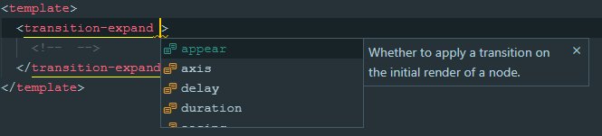
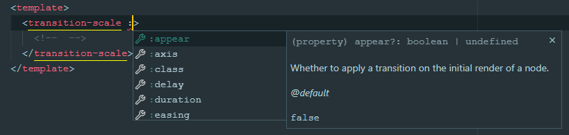
appear
ノードの初期レンダリング時にトランジションを適用するかどうか。元の Vue transition appear prop とまったく同じように動作します。
export type TransitionAppear = boolean; // Default: undefined
例
<template>
  <div>
    <!--
      This element appears when mounted if `isVisible` is `true` by default.
    -->
    <transition-fade appear>
      <div v-if="isVisible">...</div>
    </transition-fade>
  </div>
</template>
モード
export type TransitionMode = 'in-out' | 'out-in' | undefined; // Default: undefined
例
<template>
  <div>
    <!--
      Current element transitions out first, then when complete,
      the new element transitions in.
    -->
    <transition-slide mode="out-in">
      <component :is="currentComponent">...</component>
    </transition-slide>
  </div>
</template>
duration
トランジションアニメーションの持続時間、ミリ秒。
オブジェクトが与えられた場合、enter と leave の値はそれぞれenterとleaveのトランジションに使用されます。
// Default: 300
export type TransitionDuration = number | { enter: number, leave: number }
例
<template>
  <div>
    <!--
      If single value provided, the passed amount of milliseconds
      applied to enter and leave animations both.
      This element will appear and disappear within 500ms:
    -->
    <transition-fade :duration="500">
      <div v-if="isVisible">...</div>
    </transition-fade>

    <!--
      If an object given, it SHOULD have `enter` and `leave` keys.
      This element appears in 200ms and disappears within 500ms:
    -->
    <transition-fade :duration="{ enter: 200, leave: 500 }">
      <div v-if="isVisible">...</div>
    </transition-fade>
  </div>
</template>
move-duration
transition-group を使用する場合の要素の位置変更アニメーションの持続時間。
Vueにはpropsを介して移動アニメーションの持続時間を設定するネイティブな方法はありませんが、このタスクは CSSカスタムプロパティ を使用して実行できます。
👀 説明を表示
<!-- This way it can be set dynamically -->
<div style="--move-duration: 300ms;">
  <div class="scale-move"></div>
  <div class="scale-move"></div>
</div>
```

```css
.scale-move {
  transition-duration: var(--move-duration, 300ms);
}
```

</details>

```ts
// Default: 300
export type TransitionMoveDuration = number;
delay
トランジションアニメーションの遅延、ミリ秒。
オブジェクトが与えられた場合、enter と leave の値はそれぞれenterとleaveのトランジションに使用されます。
// Default: 300
export type TransitionDelay = number | { enter: number, leave: number };
例
<template>
  <div>
    <!--
      If single value provided, then enter and leave animations will wait
      for given amount of milliseconds before run.
      This element will appear and disappear 100ms after
      `isVisible` property changes:
    -->
    <transition-fade :delay="100">
      <div v-if="isVisible">...</div>
    </transition-fade>

    <!--
      If an object given, it SHOULD have `enter` and `leave` keys.
      This element appears immediately and disappears 200ms after
      `isVisible` property changes:
    -->
    <transition-fade :duration="{ enter: 0, leave: 300 }">
      <div v-if="isVisible">...</div>
    </transition-fade>
  </div>
</template>
easing
トランジションアニメーションのイージング。有効なCSSトランジションタイミング関数である必要があります。
オブジェクトが与えられた場合、enter と leave の値はそれぞれenterとleaveのトランジションに使用されます。
export type TransitionEasing = string; // Default: 'cubic-bezier(.25, .8, .5, 1)'
例
<template>
  <div>
    <!--
      If single value provided, then enter and leave animations will use it:
    -->
    <transition-fade easing="ease-out">
      <div v-if="isVisible">...</div>
    </transition-fade>

    <!--
      If an object given, it SHOULD have `enter` and `leave` keys.
      This element uses custom animation known as `bounce-in` for entering
      and simple `ease-out` curve for leaving:
    -->
    <transition-fade
      :easing="{
        enter: 'cubic-bezier(0.6, 0, 0.4, 2)',
        leave: 'ease-out'
      }"
    >
      <div v-if="isVisible">...</div>
    </transition-fade>
  </div>
</template>
no-opacity
要素の opacity をアニメーションさせないかどうか。
デフォルトでは、各トランジションはメインプロパティに加えて opacity を操作します。
しかし、画面の端から現れるモーダルパネルを実装する場合など、これが不要な場合もあります。
このpropsは
transition-fadeコンポーネントには明らかに適用されません。
export type TransitionNoOpacity = boolean; // Default: false
例
<template>
  <div>
    <!--
      This panel appears from the right edge of the screen,
      while its transparency remains unchanged.
    -->
    <transition-slide :offset="['100%', 0]" no-opacity>
      <div class="panel" v-if="isVisible">...</div>
    </transition-slide>
  </div>
</template>

<style>
  .panel {
    position: fixed;
    top: 0;
    right: 0;
    bottom: 0;
    background: #ffffff;
    width: 400px;
  }
</style>
no-move
transition-group を使用する場合に、要素の位置変更をアニメーションさせないかどうか。
デフォルトでは、group モードを使用している場合、要素が削除されると、残りの要素はその位置をスムーズに変更します。
それらは絶対位置付けされ、フローから外れるため、親コンテナの高さが縮みます。
通常、これは問題ありませんが、例えば transition-expand を使用して要素が互いに連続して配置されている場合、ぎこちなく見えます。
このオプションを使用すると、この状況での要素のより快適な動作を実現できます。
export type TransitionNoMove = boolean; // Default: false
例
<template>
  <div>
    <!--
      In this case, the height of the parent element (`ul`) changes smoothly.
    -->
    <transition-expand group no-move tag="ul">
      <li v-for="item in items" :key="item.id">...</li>
    </transition-expand>
  </div>
</template>
TransitionExpand の固有props
axis
要素が展開する軸。
オブジェクトが与えられた場合、enter と leave の値はそれぞれenterとleaveのトランジションに使用されます。
type ExpandAxisValue = 'x' | 'y'; // Default: 'y'
export type TransitionExpandAxis = ExpandAxisValue | { enter: ExpandAxisValue, leave: ExpandAxisValue }
TransitionSlide の固有props
offset
トランジション前後の x 軸と y 軸による要素のオフセット。
整数またはパーセンテージ値の文字列表現(例: '100%')である必要があります。
数値は px オフセットとして扱われ、% 記号で終わる文字列値は 要素の幅/高さのパーセンテージ として扱われます。
例と説明
オブジェクトが与えられた場合、enter と leave の値はそれぞれenterとleaveのトランジションに使用されます。
type SlideOffsetValue = [number | string, number | string];

// Default: [0, -16]
export type TransitionSlideOffset = SlideOffsetValue | { enter: SlideOffsetValue, leave: SlideOffsetValue }
TransitionScale の固有props
axis
アニメーションするスケール軸。
* `both` (uses `transform: scale()`)
* `x` (uses `transform: scaleX()`)
* `y` (uses `transform: scaleY()`)
オブジェクトが与えられた場合、enter と leave の値はそれぞれenterとleaveのトランジションに使用されます。
type ScaleAxisValue = 'x' | 'y' | 'both';

// Default: 'both'
export type TransitionScaleAxis = ScaleAxisValue | { enter: ScaleAxisValue, leave: ScaleAxisValue }
origin
要素に適用される transform-origin CSSプロパティ。
オブジェクトが与えられた場合、enter と leave の値はそれぞれenterとleaveのトランジションに使用されます。
オブジェクトが与えられた場合、enter と leave の値はそれぞれenterとleaveのトランジションに使用されます。
// Default: '50% 50%'
export type TransitionScaleAxis = string | { enter: string, leave: string }
scale
トランジション前後の要素のスケール値。0 から 1 の間の数値である必要があります。
オブジェクトが与えられた場合、enter と leave の値はそれぞれenterとleaveのトランジションに使用されます。
オブジェクトが与えられた場合、enter と leave の値はそれぞれenterとleaveのトランジションに使用されます。
// Default: 0
export type TransitionScaleScale = number | { enter: number, leave: number }
イベント
コンポーネントは特別なイベントを提供しませんが、すべての標準トランジションイベントをトリガーします。
before-enterenterafter-enterenter-cancelledbefore-leaveleaveafter-leaveenter-leave